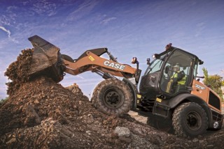
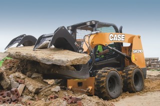
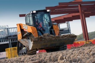
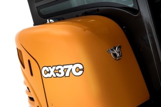
As you can no doubt tell from the images here, Case’s new look “reflects the values of the brand including its practical, hands-on approach”.
The official press hand-outs say that the new styling and livery were developed to make a strong brand statement.
It’s not all design guff, however. There is some practical point to it. “The 2D CASE lettering of the decals uses the same font as the brand logo for consistency, while the reflective white colour makes the brand name and model number much easier to read from a distance,” it says here.
More importantly, when you are sticking your badge on machines designed and built by Sumitomo and by Hyundai as well as in your own factories, it’s important to get a consistent corporate branding image.

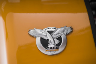
I like the ‘Power Abe’ metallic badge that is now on every machine – “celebrating the Case brand’s rich heritage”.
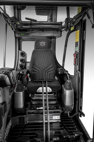
The machines’ interiors have also been restyled, from the common seat design to the dashboard and interior colours.
David Wilkie, director of CNH Industrial Design Centre says: “Our aim with this project was, on the exterior, to create a design language that reflects solidity and precision, while giving a look specific to the Case brand that reflects its history and its values and that is common to all models.
“On the interior design our aim was to use our experience to improve the comfort and quality of life on board by the use of specially developed seat trim and materials. While the interior trim colours have been modernised to give a contemporary feel, we wanted to create a strong family feeling across the product line-up.”
